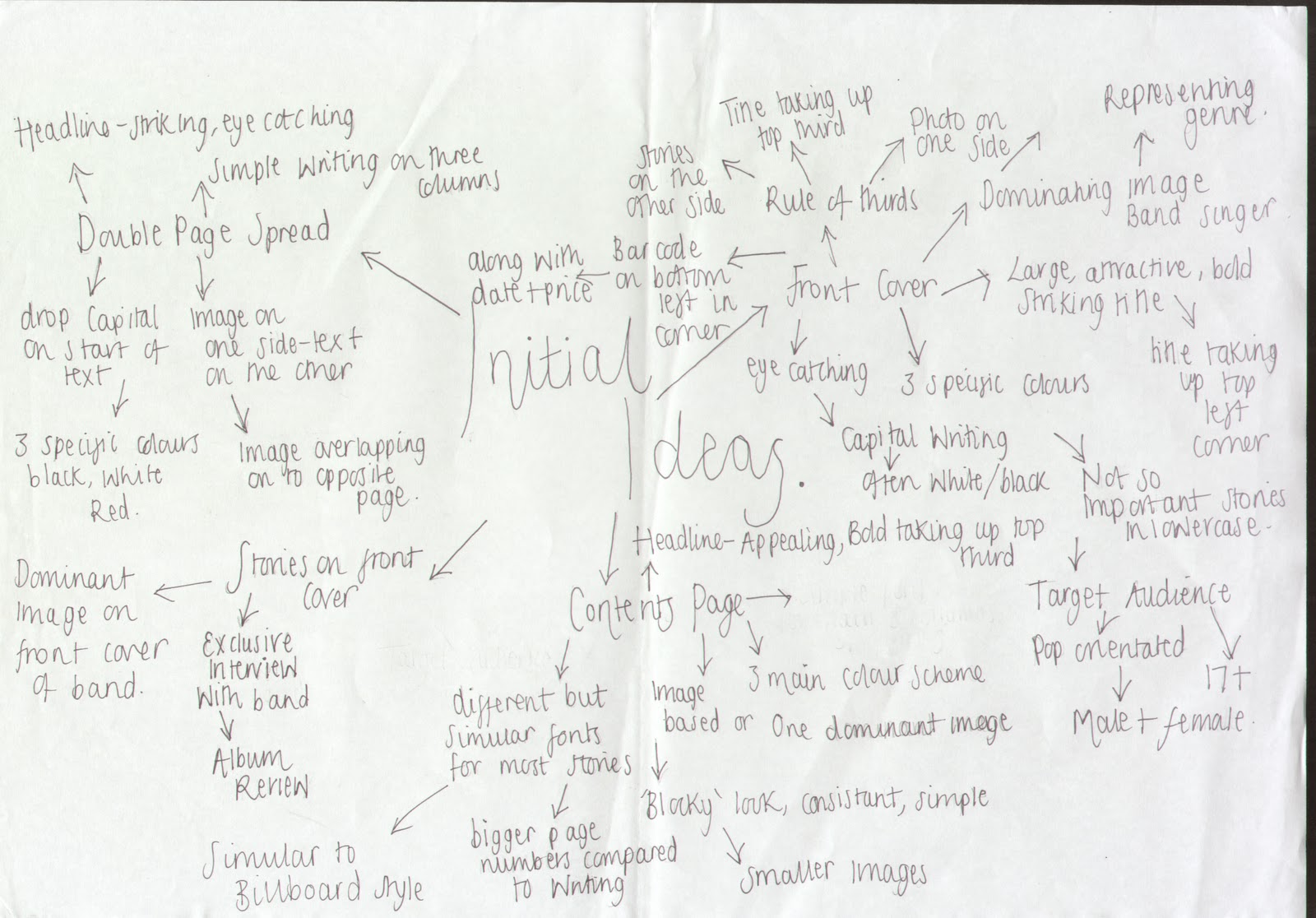
Thursday 14 April 2011

Diary Entry week Nine

This week was my final week for making changes to my peice for the deadline on thursday at 5pm, i added a sticker image on the front which highglighted a free item i felt this would draw readers to by the magazine due to it being something free. I also had to change the colour of some of the text on my front cover as some was hiden by the brightness of the photo. On my contents page i totally changed the photo and i feel this one works better and fills the part nicely. Finally i changed the background colour of my photo on my double page spread to make it stand out better and edited better to make sure it wasn't orange or too dark.

Diary Entry Week Eight

I re took my photos for my magazine, it was quite hard as i wanted to get different backgrounds, however when taking the photos the sun was either too bright making the image not stand out at all or the wind was blowing too much. So since my pictures were unsuccessful i kept the image on my double page spread however i re edited it to make it look less dark and orange. However one of my images went right and the brightness was good for what i wanted it to be like on my front page as it made me text stand out just how i wanted it too

Diary entry week Seven

I received feedback from my class which helped me decide what i needed to change and they also told me what they liked about my peice. This was good and helped alot as everyone looks at something differently. From this is i decided the image on my front cover was too dull and made my text not stand out so i chose to definatly retake this photograph as i wanted to keep my colour scheme

FRONT COVER FINAL

FINAL CONTENTS PAGE

FINAL DOUBLE PAGE SPREAD

Thursday 7 April 2011

Feedback

For the front cover the feedback I was given about my front cover, it was brought to my attention that my front cover strap line was too big- so I plan to decrease the size of the black strap band and make it not take up too much room. For my rough cut it has been highlighted that I didn’t have a price, issue number and date on my front cover. So I am going to include this when I change my front cover as these are all typical code and conventions that need to be on a front cover.
It was stated that my name of my magazine and the font chosen for ‘exclusive’ was successful so I don’t plan to change either of these when doing my final front cover.
However it was said that my photo shown on my front cover was attention grabbing and the colour scheme was good. But one thing I plan to change is the picture and make it brighter because someone stated that some of my writing was hard to read, but I feel that if I was too change my photo and make it brighter then the text would stand out more as I do not want to change my colour scheme as I feel all the colours work well together.

For my contents page the feedback I was given was that the background of my photo was unprofessional I agree with this and I am going to retake the photo and make sure the white sheet is not seen, I still plan to have a plain background which is already on the back of my contents page but I am going to cut the model out using photo shop so it doesn’t look so unprofessional I am also going to make sure that the image is not too dark and you can see it more clearly. Finally I am going to check my font sizes to make sure they are all the same as somebody wrote that they looked as if they varied so I am going to change it so they don’t contrast.
Things that were successful on my contents page were the layout as it was said to be ‘strong’ and that the text was clear so I am not going to change either of these. However I am going to change it slightly to make the page more interesting by getting a better image for the page instead of something so simple.   

For my double page spread feedback I forgot to put the page numbers on which is a typical code and convention so I am going to make sure that this is put on. It was also said that my image was too dark with an orange tone and there were shiny patches on my model, so when I re take my photos I am going to make sure I don’t edit it to make it look as dark and make sure I edit all shiny patches to make it look professional. Also it was said that the introduction could be in a larger font so it stands out more so I am going to take on board this to and change it to a larger font so you can see it more clearly against the columns of writing. Finally I am going to include a picture caption as this is what normally what is shown on the photo in a music magazine.
However it was said that my layout and font was good for the artist’s name, and that the pose and mis en scene was successful for my photograph so I do not plan to change either of these things. But to break up the columns of writing on my double page spread I am going to include purple lines. 

Photograph Planning Grid

Friday 1 April 2011

Diary entry week six

After handing in my rough cuts i decided i would re take the photos i had used so i could vary in location, mis en scene and the actual camera angle. All photos had no particular background so by doing this it would vary the scene of the photograph and also change the lighting. I am also going to going to decide on a different photo for my contents as i feel this one didn't work as well as i wanted it too.

Diary Entry Five

I decided against the idea of using 'The Saturdays' for the cover and double page spread because i thought having 5 people on the front cover would be too much and i thought it would look much more effective if it was just focused on one person. So i decided to base my music magazine on 'Kesha', i have also decided to change the colour scheme and base my magazine on 'Vibe'. This was more to my style and i could vary the colours i wanted to use as they use different colours every week. So i chose to use purple as this colour was subtle and was not too girly like pink would look.

I took photos of Melissa modeling being 'Kesha' i googled photos of her to decide on what pose and mis en scene she needed to have:  

Diary entry four

From doing my market research i now know exactly what i want to take forward to my magazine, i am going to create a magazine for teenagers who are interested in mainstream/chart music. I chose to do this because it appeals to a wider range of audience instead of just sticking to one pecific genre. I am going to focus my magazine on girl band 'The saturdays' as i think they would be appealing on a front cover for my type of magazine and the photos would look good. The colour scheme i am going to do is Red and black as my style model is Q

Friday 4 March 2011

Initial Ideas

Diary entry week three

This week i made my pie charts for my market research i also developed on this by analysis where I wrote why people had chosen what they had and why they hadn't. After i had done this i had to put all of my 15 Analysis' onto my blog, this was to show all the research i had done before making my magazine myself. Finally this week I also learnt the small things that made up the pages which made the magazine look professional but were really easy to miss out. E.g. barcode, date, headline, page number, colour scheme etc.

Who is your favourite artist at the moment?

From the research I have done on who peoples favourites band/artist is they seem to be a wide range of music varying from pop, r ‘n’ b, rap, indie, hip hop. This indicates that today people like a wide range of music it is normally not just one specific genre that they listen too. All of these people which have came up are well known main stream band/artists apart from Mumford and sons as these are really not known of. All of the above minus this band are always seen in the charts with their latest songs making a lot of money. Not only do they have a good voice their appearance gives them a good audience also as normally men want to see them rather than hear them. So I think this is something I need to impact into my magazine to make it more appealing and gain more consumers.

What do you want to read about in a magazine?

This question is one of the main features in the magazine as if I wrote something that was not what something my audience wanted to read then it wouldn’t work well and wouldn’t sell as it would not be what they wanted. So having something they want to read about will be one of the main factors because it will make them want to read the magazine. From this question I have learnt that people want to read interviews in my music magazine I think this is because interviews in music magazines tend to be exclusive where they get the first information from that artist, I will be taking on board this idea as I think this is appealing to a reader because if it is exclusive they wont have heard it before and they are always interesting to read. I think latest music was not that necessary due to the fact people mostly know it all anyways. And with gossip I don’t think this is appropriate in a music magazine however a little bit could be involved but it is not the main focus of the magazine as it is mostly all about bands. And normally the band will talk about their album in the interview so this is incorporating two things in one so I don’t think a single page for it would be necessary.

What genre do you want to read about?

This is another main factor in my making my magazine as I want my audience to enjoy and be to their taste what they are reading about, because if it is not what they suggested then they probably wouldn’t even buy the magazine. I think this has a big impact when buying a magazine as you can normally tell from the stance and image of the artist/band on the front cover what genre it is going to be; even from the clothes that they are photographed wearing. And it will turn people away if it is not who they want to see, as normally the person pictured on the front cover are people who are featured throughout the magazine so this would be a draw back to them. It would also seem that if it looked a specific genre on the front that it would be the same genre throughout the magazine. From this question 52% of people voted pop which means I couldn’t have an indie/rock style for the front cover of my magazine as this wouldn’t be what my audience would want and appreciate. This fits in well with my question of ‘who would you like to see on the front cover’ as the Saturdays were chose and they fit in with the genre that was chose, so both of these choices work well together as they don’t contrast with each other since they are both in the same genre.

Do you prefer the blocky style or image heavy style?

68% of people prefer the blocky style I think this is because it is plain and simple and easy to read, whereas the image dominant is busy with images  and can sometimes look too much when surrounded by text. I would prefer my contents page to be approachable and easy to read so I will use the blocky style because as well as this, this is what my audience want to see which means they would prefer it too. I think this is an important feature because if the information on the contents looked unappealing then people would not read it, and this is bad as this is where you find the information out about what you want to read. And i think an advantage of this style is that it is easy to quickly find what you want to read about as nothing else is taking your attention

Would items such as free cds and posters make you buy a magazine?

Often on music magazines cd’s and posters are included to give more of a reason to buy the magazine, as it seems you are getting more for what you are paying when freebies are added. It is normally taking up the cover of the magazine so it is more out there instead of something else on the cover gaining your attention. Even though people would probably not use the product as it will normally be cheap and tacky people today still buy a magazine if it has a freebie in it even though it will end up in the bin. Especially since people don’t really go out and buy cd’s anymore, because if they want some new music they will just go and download which they can do for free instead of wasting money on importing a CD onto their play list then never using it again. However I will definitely still put it on my front cover that there will be freebies inside as 76% of people said this would make them buy it and I also think it would be a good feature to include, but I will not put the freebie as a free CD I will use something where they have to save up vouchers and win something over £30 so it is more cost effective and gives people more of a reason to buy the next issue as well as the good stories.

What kind of magazines do you buy?

I asked people this question to find out the variety of types of magazines they buy that they are interested in 45% of people that I asked said they bought gossip magazines, which meant they liked to read about what celebrities/artists were up to and the latest information about them. Even though this is not normally a main feature in a music magazine, I will incorporate this in with the music magazine style anyways and have a page on latest gossip about artists/bands today that are most talked about as I think this would make my magazine unique to others as this is not normally included. Since music got 42% I will still make sure this is the main feature that I talk about considering it is an actual music magazine but as well incorporate what I stated above.

Why do you buy thew magazines you are interested in?

Stories was the most popular reason why people buy magazines, after people have been drawn in by the image present on the front people normally read further into the magazine to see what stories are included especially on the contents. Since a huge 60% of people said this was why they bought the magazine I will make sure that all my stories that I include are relevant to the genre which I am doing and include new and up to date stories about mainstream people who people know well of. But I also feel that the image on the front cover is also important and I think this is one of the main reason someone actually picks up the magazine if the image is dominant and approaching the reader. So even though stories got a higher percentage I will also make sure my image of my band is standing out on the page and it has the effect I stated before on the reader.

What features of a magazine are most appealing?

Images got 48% of the vote of what is most appealing, so I need to make sure the  images that are on my front cover are striking so it gets drawn to the reader. I also agree with this statement as if the picture on the front cover wasn’t out there and wasn’t almost as if it was looking at you then it wouldn’t sell. Because this is the first thing you look at when you buy a magazine as it is normally the main focus and usually tends to be very dominant. Bold text only scored 4% I think this is because it is normally featured on all magazines and is not the first thing you look at when looking at a magazine It is normally the image which I have stated above. Musicians also scored a high percentage of 32%, I also feel this is a main feature in a magazine so I will incorporate this also as well as having striking images. As I think that if you didn’t know the artist featured in the magazine it would be unlikely that you would buy it. However if it was someone in mainstream music for instance you would definitely be more inclined to purchase it. 

Who would you like to see on the front cover?

This question is the most important out of all that I have done, as it will be the image on my front cover, so they will have to be popular and well known for it to work well. From this research it has come to my attention that people prefer main stream music instead of alternative bands that are not really heard of that much as they are more in the know so you can refer to the artists from what you already know which I think is a main factor.. Most of the above are all solo artists and they seem to be more popular amongst the people I have asked. However the Saturdays were the most popular I think this is because they are appealing to both audiences- male and female. Female being that they enjoy their music but male also as they probably find all the girls attractive as they are all beautiful. Along with this they are always in the chart when they bring out a new song, and this is because their songs are catchy and you can listen to them a number of times. However just so it could appeal to a wider audience I could incorporate stories on the front cover about the people who were less popular so it is not just focusing on one main artist. I could use the image of the Saturdays on my front cover and my double page spread as I think it looks good when the theme Is running throughout the magazine, as most magazines take on this idea. Whilst doing my market research I think when bands are the dominate image on the front cover it works well as it gives you more people to focus on instead of just one, and you learn more about the whole band. As I feel that when it is just talking about one artist- such as a solo artist, it can get boring as there is no differentiation.

What Colours do you think look best?

Black, white and red. Black, white and yellow. Black, white and purple. All scored 28%, I can understand why black white and grey only scored 16% because compared to the other colours this is very boring and not at all striking. And I think the colour on the front of the magazine is one of the main impacts in why people are drawn to it. Since the three above colours scored all the same I will have to make a decision myself to which colour I will pick, this choice has to be thought through though as it will be a running theme throughout my magazine so it has to work well and look striking.

Vibe Front Cover

The image on this magazine is covered partly by ‘Nicki Minaj’s’ head, this highlights the fact that this magazine is already established and well know so doesn’t need to be fully out there to be known as it already has that factor and its fan base. The image is taking up the centre of the page and with the obvious editing on photo shop so it looks striking with the perfect skin and shimmering in her clothes especially with all the matching colours of pink, blue, white and black. The page is made up of those 4 colours and since they are only used frequently and for the right things it works well and definitely stands out the most from all the magazines I have looked at. From this image of Nicki Minaj you can tell that she doesn’t care about what people think about her especially with what she is wearing, her hands on her hips back up this point and her open mouth as it seems she thinks she can do what she wants when she wants and does not care what people have to say. She is pictured in front of a cloud of flowers, this illustrates that she just wants to have fun and we can tell this by what she is having its almost like she doesn’t want to grow up. The colouring of the background is aesthetically pleasing even though there is a lot of white it still looks very out there. The ‘Vibe’ title is taking up the top section of the page and wrote in big capital bold font, with the white matching everything else on the page e.g. the dress and cloud. Stories are positioned on either side of the page ‘Nicki Minaj’ is in the same size font as the rest which is different to the rest of the front covers I have looked at as usually they are the main focus of the front cover since they are pictured on it. The pink and white combination which matches the boots she is wearing is used for the stories nothing stands out on this page apart from the black writing which is used for ‘Michael Jackson’ And ‘World cup’ mania, even though they don’t stand I still think it looks extremely effective since it is so matching. The barcode is placed on the left hand side vertically on the front cover along with the website above it, this is again in matching colours so works well with the rest of the page.

Vibe Contents Page

This page takes on board three main colours- grey, black and white. I think these colours usually look boring and masculine, however I think this page looks very attractive and appealing to read. The women taking up the majority of the page is wearing matching colours to the background, it is almost like she is trying to blend in with the background. But she does not due to her skin tone and dark hair, and especially the way she is positioned on the floor with her legs kicking high, it is a very unique picture therefore I think it would make readers want to read more. The title ‘Contents’ has been broken down into 3 lines which I think is very different and it is like the model is holding it up with her foot even though she is not. Everyone knows what a contents entails and this magazine knows that so they feel they can do what they like with the title and positioning and people will still know what it is. This is the only white thing on the page and since it is in bold it stands out for all the right reasons.

Vibe Double Page Spread

The colour scheme on this page is very subtle with the black and white images on the background, along with the grey writing, blue is used twice to emphasise her name and to make it stand out amongst the grey simple text- this may be cause she is not well known of, so that would be the first thing that stands out whilst you are scanning the page. The black and white theme is what makes the image so striking as this is the only thing in colour, especially since she is wearing a vibrant red dress, so instantly your attention is drawn to her which is what she wants as she probably wants to stand out from her sister ‘Beyonce Knowles’. As well there is nothing taking the attention off her as there is no text positioned around her it is all just white. Black writing is used once on this page to highlight a quote she has said from the article, this is a typical code and convention of a magazine and many do this. The smaller images behind her contrast with the main image because the background pictures tell a different story- of her just having a good time and being herself, this is sectioned off with 5 black stripes this goes well with the images since they are bold and black and cuts it off well. Whereas the main dominant image looks vulnerable as if what she is going to say is going to be emotional but I think this technique has been used wisely as I think it could gain her audience, because people will look at her facial expression and what to find out more. I think this image would be directed at women and women only, as the whole page looks feminine especially with what she is wearing, I can’t see a man being drawn to this page unless they found her attractive. Also ‘Solange Knowles’ type of music isn’t very masculine so I don’t even think they would even know who she was. Four columns are used for the writing in simple sans serif font, with an image placed in the middle this makes it easier to read as it makes the text deceiving as there doesn’t seem as much. The writing above the columns above this is in capital letters and bold font even though the colour does not stand out much it still works well with the theme that is being portrayed.

XXL Front Cover

The front cover presents one main centre dominant image, this is of 50 cent and he is staring directly at the person reading the magazine. I feel this is very effective way to grab the readers attention because the image is so striking, and this will make it stand out on a shelf, as when it is surrounded by others it could blend in, however this has the opposite effect. The image is so striking due to the expression 50 cent has on his face, he has one raised eye brow which portrays his arrogance and this is backed up by the perfection of his hairline which Is poker straight. The bio colour method is used on the title of the magazine which is ‘XXL’, this is in 2 colours of white and red, this is placed on the far left which is typically where most magazines place the name. Even though it is not taking up such a large space like others do it still works well in the structure of the front cover, and since it is bold it still stands out. This front cover does not have a busy page of stories on the front, it has one main story of  ‘the power of 50’, I think this works well as it makes the reader intrigued to want to know what else is in the magazine which makes them flick through. This is wrote in simple bubble writing with a white outline, this works well as you can still see the background behind it, and since it is the only story it is wrote quite big which highlights the image again because the way 50 Cent is looking its as if this whole magazine is about him, when it is not. On the far right of the front cover there is a list of well known rappers in black and white writing and edited in bold, they are also in capitals which makes it stand out against the background which is a blue shading. Since the rappers are well known this will gain the audience of the magazine as if you were interested in any of them you would want to know what was inside the magazine about them since there is not a line which is telling you about it. There is three main colours of on the front of the magazine which is black, white and red, I feel this works well as I think if there was too many colours used it would be too busy and this makes it look simple yet striking and I think on my magazine I will take on this effect as I think it works well. The barcode is positioned vertically on the bottom right along with the date and price.

Thursday 3 March 2011

XXL Contents page

Along with the front cover the contents page again has one main dominant image taking up the page, this is of 50 Cent again trying to portray his cool/gangster style. The picture reflects his style as if he was pictured smiling he would look feminine and with the emotionless look on his face it illustrates his type of music since it is rap heavy. The picture is also covering up the first two letters The contents follows through the style of the front cover with the blue shading, this is reflecting off 50 cent’s jacket which I think looks good against the photo as it makes it more of the main focus like as if a light was shining off him. The contents colour scheme is white and yellow, this works well with the colour of the background, as they stand out above it and since yellow is so vibrant it makes the words stand out better. Slang words are used to express the stories e.g. ‘The Chiper, Dog Years’. This illustrates the style of the magazine as these are the type of words rappers use as they never really speak in proper English due to the words they use in the songs. ‘Top Billin’ is on a slant at the top left vertically, this could be classed as slang for top news?, which leads to the fact that only 4 stories are included on the page this only covers the main well known people in the magazine, which will get the readers attention more cause normally when reading a magazine you only really want to read about people you are a fan of or who are well known to you. So this might reflect ‘Top Billin’ which may mean top news and that is definitely illustrated. The main story is in a bigger font compared to these stories, this will be because it is the main story in the magazine therefore they want people to make sure they read it and with the big font it is almost in your face and makes you want to read it especially since 50 Cent is such a big name and well known by mostly everybody. On the bottom of the page there is a black strip which cuts off the page this includes writing in small white print of who the barber is, the clothes brand, and photographer on the bottom right. It is almost as if 50 Cent is such a big style icon that people can achieve this look by doing and wearing exactly what he is, this is also something that people would be interested in especially 50 cent has many fans.

XXL Double page Spread

This page does not reflect the front cover and contents like they did, this is because it is a totally different rapper and colour theme so the theme does not run throughout the magazine. The colours included on this page are grey and black, these are very masculine colours however this makes the page look edgy and even though it would seem that it was directed at only the male audience. I think anyone that was interested in rap, rnb would not feel this way and would feel comfortable reading it because it was about someone they liked listening to. These two colours work well also as the image on the right of the page of Lil Wayne is in black and white so they colours go with the image. The image works well with the type of magazine it is with the way Lil Wayne is pictured, he is positioned with his arms stretched high and his face is in a gaze. It is almost like he is recognising his fans and the focus of the picture is very personal as he may be creating link between himself and the fans and I think this is simple yet effective as you can read into the image. This image is not gender specific as women could find him attractive which would make them want to read about him as well as liking his music as well as men. However the image would not appeal to all audiences as rap music is a specific type so it would just be whether the reader enjoyed that type of music. The image and the text is evened out equally by having a page each, I think this looks simple but works well as sometimes when the text is over the image it is less of a dominant image and does not stand out as well. The headline on this page takes up one third of the page so it stands out well, especially with the pixelated black font which contrasts with the three columns of writing which is in a simple and basic font. With the headline taking up so much room it lets the reader know exactly what he is going to be reading about especially with the dominant image, so its almost all in your face.

Q Front Cover

This cover has one main image of three people however it is not a group photo or a band, they have all been taken separately and then put together. By Q doing this it highlights the difference in each of their music, as Lady gaga is pop music, Jay z is rap and Dave Grohl is rock. This is what Q magazine wants to portray as that is the point of the magazine it includes a wide range of music it is not one specific genre. I think since they have used a white background it makes the image more effective and works well with the genre of magazine. Even though they are all obviously the main focus in the magazine due to the, Big orange bold font with their names listed on the left hand side of the page, Jay Z stands out the most and seems the most dominant figure out of the three people. By this the audience will know that he will come up a lot throughout the magazine with his stance. The writing underneath the Artist’s name is in a smaller black bold font, I think the orange is used to grab the attention of the reader and for the reader to want to read into more about the artist if it was someone they liked, once they have grabbed the readers attention they don’t need to put the writing in a such striking font as they will already have gained their attention. Lady gaga is taking up some of the Q letter, she can get away with doing that as Q is already an established magazine so everyone already knows its name and what its about so even if it was partly covered this wouldn’t take away that fact. There are 4 main colours used in the cover of this magazine; orange, black, white and red. Orange is used to highlight the most important points on the page, it is used well in the ‘Exciting people’ in ‘The 10 most exciting people in music now’. By them doing this it emphasises the point they are trying to make and makes this more in your face so you want to read into it. Everything on the page is wrote in capitals I think this looks good, however I would want to use capitals and lower case on my front cover as I want only certain things to stand out. The title of the magazine ‘Q’ is positioned in the typical place every magazine places their title- on the top left of the page at the top, this is a typical code and convention of a front cover so is a definite must to put it here. Circles and an oblong shape have been used to make information stand out instead of just writing a list of what is in the magazine, I think this effect is good as it makes it less unappealing to read, because it is standing out and only in small words.  

Q Contents page

The contents page is set out on a double page spread, this is unusual for a magazine as normally a code and convention of a contents page is on just a single page. The page is image dominated with many images spread out across the two pages, on one side there is an image of fifty cent in sunglasses and looks striking with the read light shining on one half of his face, this works well as the main colour on this page is red and is very effective that this is taking up part of the photo. All the main stories have a picture for them and a big bold number of the page number, I think this way is a good way of doing it instead of doing it in a typical bold text and is more appealing to the reader as if they wanted to read about their favourite artist they would just have to look out for the photo. The left page includes all images of all the people on the front cover so the theme is carried throughout; they have took images of lady gaga and Dave Grohls double page spread this is a different way to portray the information and I think it looks good and different. There is 3 main colours on this page red, black and white, this theme is followed through from the front page minus the orange colour, I think this is as they already have the readers attention. Red stripes are used to section off each story, which makes the stories more approachable and easy to read as well as the capital writing of each Artist, instead of having a block of writing which is unappealing to the eye. San serif font is used which is simple text, underneath the capital block writing to tell a little bit about what is going to come up. This is a typical code and convention of a contents page as readers want to know what they are going to read about. There is also an image of the front cover on the page, I think this is good as it highlights the theme that is running throughout both pages especially with the thick red stripe going across the top.

Q Magazine double page spread

The picture and writing is both split evenly on this page, giving each a half and half divide. On the right the picture is used again of Jay Z which is the same as the one featured on the contents page. Again the picture has red shading on one side of the picture and the other is white which gives a different edit to the image of 50 cent. This reflects that the theme is running throughout the entire magazine which is appropriate. This image of Jay Z illustrates his personality as he is pictured wearing big black sunglasses, plain black t-shirt and a chain, his genre of songs is rap which makes him come across as a gangster and this image definitely portrays that. With him wearing sunglasses this emphasises his arrogance and shows he can do what he likes. By him doing this it also reflects how he doesn’t need to have his face on full show to be recognised by his fans he can still have his face a partly covered for them still to recognise him since he has such a wide fan bace. The page of writing is writing heavy and takes up the full page, it is wrote in a simple font, however to make it more striking a big red bold J is placed in the centre of the page, this is effective as not only Is this the first letter of his name but it is also the first letter of the first word in the article. A bold T Is also used at the start of a new section in the article even though these two features are the main thing on this page I think it is effective.

Friday 18 February 2011

Billboard Front Cover

The name of the magazine ‘Billboard’ is taken up by Rihanna’s head, established magazines can do this as people already know the name of the magazine and what it looks like. So even though it is partly covered people can still realise what it is. This picture of Rihanna is very dominant even though part of her body is in it, as it’s her eyes that grab the attention of the reader even though one is covered. This portrays her style and image from the way she is looking as she will want to look mysterious which is what she is putting across and that what she is saying in this interview isn’t just a ‘kiss and tell’ it is serious and meaningful. Four colours are used on this page- Black, white, yellow and red. This is a good amount of colours to use as the black and yellow are only used briefly on the page so on the bits that are coloured in that colour they stand out well as it is not used much. With Rihannas hair being so red the colours still work well around it and everything is still standing out and it is not just her hair. ‘The Reinvention of RIHANNA’ is taking up the bottom third of the page this looks effective with the bottom of the text almost fading into the background. This also implies she is the main focus of the magazine since her story and herself is taking up the majority of the page. ‘Billboard’ is taking up the top section of the front cover which is a typical code and convention and I think this is a perfect size for it to be as it is not too big but it still stands out. Other stories featured in the magazine are positioned around the picture of Rihanna; this shows her dominance on the cover as things are positioned around her. The title of each story is made to stand out with the yellow background with black bold capital font, this works well as it is simple yet still stands out due to this. And there is only a small amount of yellow so you would be instantly drawn to this. ‘Film and TV music conference’ also stands out due to this, as well as how it wrote in capital letters. The barcode is positioned on the bottom left of the magazine along with the price, this is a typical code and convention that needs to be included on the front cover.

BillBoard Contents Page

This contents page a ‘Blocky style’ as 4 pictures are used, with writing surrounding it. 4 colours are used for this page, this works well since it is on a white background because everything is made to stand out not just specific things. Bold blue writing is used for part of the line of the story; this engages the reader to read on about what is actually in the magazine if they are interested in what this line says. The contents is split up into 6 different sections depending on what they are about, this is a more organised way to do so as it breaks everything up so you can quickly find what you are wanting to read about if you just find the section. This magazine has tried to break down all information by using different techniques to portray the information as images are used to tell the story rather than text, as pictures are used with page numbers on top of them. The contents title is in a bold style this takes up a small top section of the page and is in simple back but works well as some of the people in the pictures are wearing black so it blends in well. The page is split off with a blue line on the far left to leave a section of ‘No1 on the charts’, this is taking up the whole left third of the page, and does not continue with the theme on the other side as it is in grey. This is a feature I have never seen before but I think it is different and definitely reflects the music genre of the magazine as it is quite clearly full of mainstream music, and this list will be full of what is playing in the chart. There is one main image on this page and again the text is displayed around her, it’s almost as if she is in control of where the text goes.

BillBoard Double Page Spread

This double page would appeal to both audiences I think, its just whether you enjoy ‘Florence and the machine’. I think the image of Florence on this page is very eye grabbing as the redness of her hair brings out the colour of the cloth that she is sitting on, so not only is the reader drawn to her face, but they are drawn to the full article also as the image is overlapping onto the next page. I think this image would appeal to all audiences as she has quite a wide fan base, and the way she is positioned for this photo it seems she is doing it to gain fans by the way she is looking straight forward with her full body on show with her posture, it isn’t like she is hiding away but would still be recognised. I don’t think this image is gender specific, I think it would gain both audiences of male and female, especially males as they probably wont have of heard of her before, but with her posture and legs out they will find this appealing and what to find out more about her. Four colours are used on this page- Black, grey, white and red. A small amount of area is used for each colour, this looks good though as the colours aren’t repeated a lot of times they are only used twice maximum so it makes the page look simple yet stylish. The headline of this is ‘USA got the love’ which is quite catchy due to the fact that she is known for her song ‘you got the love’ so this is a good way to draw in the reader as they will most likely know her song. USA and you got the love is in two totally contrasting fonts, USA is taking up the whole background of one page and even overlapping to the next, I like the difference in fonts and I think it almost reflects her style as she doesn’t want to be all out there in the music industry she wants to be known for her songs which she has really thought of. So I think this portrays it well with the capital boldness for USA which emphasises just how big the USA really is and the wide range of music industry it has in it , which then flows through to a smaller ‘got the love’ which is in italics and smaller which is like herself in the USA. A drop capital is used at the start of the text, this starts the three simple column structure off well and makes it more appealing to read.

Rolling Stone Contents Page

The theme on this page is trying to portray an old fashioned style from the 1960’s; this is done by the black and white photo that is dominating the page. You can clearly tell that it was taken along time ago since no photo shop is used or effects. Since the image is taking up the majority of the page this makes it an image dominant style. ‘Johnny be good’ is placed underneath in bold black font bigger than the rest of the fonts on the page, this implies that it is the main story that is featured in the magazine since it is being focussed on so much and is emphasised by taking up two thirds of the page. Underneath this is sans serif font which goes well with the theme they are putting across (1960’s), this again is bigger than the other font on the page. It is almost like the page is split into two different sections by an invisible line, as on the left hand side which is only taking up a small amount of the page compared to the black and white image. A small square profile picture of Beyonce is used at the top of the page, this contrasts with the image next to it as you can tell it has been edited by the brightness. But this also reflects the genre the magazine is trying to portray because Rolling Stone magazine includes a few different genres in its magazine, it doesn’t just focus on just one. Three colours are used on this page of; black, white and pink. Each colour has its own type of wording it uses depending what it is for example, when page numbers are wrote they are wrote in pink- this is a typical code and convention on a contents page as it is something that must be present. And black is used for the writing, however the two main pictures have their page numbers wrote in a larger black bold font, which highlight its importance on the page. The stories featuring in the magazine are all tightly positioned on the left hand side of the page with bold larger writing used to describe the main point of the page, this is used to grab the readers attention so they can quickly find what they want to read about. Then a smaller font is used to describe more about the page, so if you wanted to read about something you could find out more information on the topic.  

Rolling Stone Front Cover

The ‘RollingStones’ magazine title is covered by the main image picture, this highlights that the title of this magazine is already well established and has a name for itself so it doesn’t need to be out there to be known. The way lady gaga is positioned directly in the centre of the cover makes her appear mysterious and makes you ask yourself ‘why is she just standing there covered in bubbles’. But this also reflects Lady gaga’s style as she herself is a very quirky woman with her own style so with her image wanting you to want to know more this will be exactly what she wants to be put across as it’s the type of person she is. This front cover has three specific colours of white, pink and grey; I feel this works well as it makes the cover not look too busy and gives the front cover a theme running throughout the page so it looks effective. However I think it gives the front cover a feminine look so may draw back male readers as they may feel it looks too pink, however the male audience could be attracted due to thinking she is attractive. ‘Lady gaga; is in capitals and is in the largest size of font on the page, this highlights she is the main focus of the magazine and that she is basically the reason for you buying the magazine. The stories featured in the magazine are positioned on the left of the magazine as well as the right, these are all in the same font so none of them stand out in font wise, but they do against the pink background. The list of stories are wrote differently to normal in this magazine as the list changes in styles of font from small bold writing to larger un bolded font, however all these stories are not more important than others, so I think this magazine just does this to represent the style rather than make important focus stories stand out.

Rolling Stone Double Page Spread

The image of Lilly Allen is taking up a whole page and is even overlapping to the next page with her arm sticking out. Her hair style is quirky and this is definitely being portrayed in this image with her black hair and black eye make up which goes with the theme running throughout the page, the red shirt even works well with the two bits of red writing stating her name ‘Lilly Allen’ in case you didn’t know who the artist was. Her posed hand on hips pose, gives off the impression that she is an established artist who is very well known. Her hands on her hips reflects the attitude she has and this is emphasised by the quote taken out of her interview which is taking up the majority of the page stating she doesn’t care what people thinks and she can say what she wants, which the image definitely backs up. I think this is an effective way to grab the attention of the readers, as the large title makes the 4 small columns of simple style font writing look less than it actually is as it is taking up such a large amount of space. The writing stands out especially well with the black thick edging around each letter; this makes the white writing stand out from the pasty white background. Again this quirky text illustrates Lilly Allen’s style, I think the person featured on the page helps the editor make the page as I have found out that the style and writing on the page is done depending on the style of the person, so every little bit of the page is about them and their style. I think this image and the page itself wouldn’t gain readership off men as Lilly Allen’s music is mostly directly at women, since she occasionally puts men down in her lyrics. The style and image of Lilly would also not be appealing to men unless they had a quirky style themselves or found her attractive.

Diary Entry week two

This week we focused on market research, i had to create a questionnaire where i would ask 25 people it and find out exactly what they liked and appealed to them in a magazine. After I had found out this information i put my information into pie charts, and wrote about why I thought people had chosen what they had and how i would follow through with what my audience wanted on my final product. I also wrote why i thought people hadn't chosen the other options in the categories. To make my information more creative when presented i am going to do a pod cast of 5 different people to see what they would like to see in a magazine

Diary entry week one

This week we have learnt exactly what needs to be talked about when analysing front pages, contents page and double page spreads, so we could go through with our task and analyse 15 of the above. When doing this I had to make sure I picked out every detail on the page and talk about codes and conventions that were always used on these pages.

Wednesday 9 February 2011

Evaluation

In what ways does your media product use, develop or challenge forms and conventions of real media products?

When producing my school magazine I used the colour scheme code and convention throughout the front page and the contents page, to do this I used 3 main colours and repeated them throughout the page to not make it too busy with colours. I chose blue to be my main colour as I thought this suited both genders and was not directed at just one so it worked well. Another main code and convention I used the big bold main headings for the name of the magazine and the contents header, I took this inspiration from ‘Chill’ magazine. I thought this was good because it makes the page stand out well and you can immediately see the text which is the main feature on the page. When I did my magazine my titles took the top section of the page. When looking through the different contents pages of the magazines not many of them featured many images and if they did it was only up to 3 images, so I decided to only feature two on my contents page as I thought this was an average amount and this is also what ‘Chill’ did and I thought it looked good when only a few images were placed on the page. Another main feature of the contents page was the page numbers, each of the magazines I looked at had a line of what was included in the page, ‘Chill’ magazine used this well and I followed through with what they did. Even though none of the magazine front covers used the ‘rule of thirds’ I did this on mine as I knew it was an important code and convention, by doing this I placed my text on the far left with my image on the right and my title taking up the top third of the page. Finally I used a basic font on both pages; all magazines did this I think this was to make it look more simple and easy to read instead of looking too fancy and making it hard to read. This inspiration was taken from the ‘George Stephenson’ magazine, because I thought it looked appropriate and simple.

What have you learnt about technologies from the process of constructing the product? 

When taking a medium close up you had to focus the camera, to ensure that it didn’t end up blurry. After this was done you were ready to take the photo if you were in the right location. Depending on whether the place was dark and gloomy or not depended on whether you used the flash, since the place were I took my medium shot was dark I used the flash to ensure you could see the  image I was trying to capture. When I was constructing my magazine I used the text tool a lot to add text on to my front page and my contents page, from this I began to edit the style of the text by making it bold and navy. Since I had lots of layers it was good that I could move them around and could do last minute changes, which I did do by adding a background image that I took of Whitley high school. When doing my layers I could change the order of where things were positioned on my page. I used the lasso magnetic tool to cut out what I wanted from my main image that I used on my front cover, this let me cut out exactly what I wanted from the image and leave the rest. The move tool also allowed me to change the positioning of things on both of my pages; I played around a lot with this to see where I could place my images and my text to make it look better, especially in my contents page since there were a lot of pages to include. I used the clone stamp tool on my main medium shot on the front of my cover to get rid of blemishes and make the picture appear better.   

Monday 7 February 2011

Front page and contents analysis

Front page analysis

Throughout all magazines bright bold colours are used; this grabs the readers attention and would make it stand out on whilst it appears on the shelf since there is such a variety to choose from today.

Again on all magazines there 2 or more photos featured on the front cover, this makes the information on the front cover more interesting and the text becomes more appealing to the eye. Because if it was all writing nobody would want to read it especially since all these magazines are aimed at teenagers. ‘Fusion’ is the only one with one central Image, however this is appropriate since it is a music magazine and makes it more edgy.

All magazine names on each of the magazines are bold and mostly in capitals, when you write in capitals it is almost like you are shouting at the audience so this is a good technique to use to approach readers.

‘Bishopbriggs’ and ‘Evolve’ are the only two magazines out of the selection that do not have any paragraphs of text on the front cover, this would be more appealing to the target audience as they just get straight to the point of what the magazine includes instead of writing loads of text. On the rest of the magazines the text is placed on either the far right or left of the magazine this presents the cover better and makes the text look more approachable to read as they are only small little paragraphs. And if the text was scrambled all over the page it would look too much.

None of the magazines use rule of thirds on the front covers this is probably because they haven’t used proper programmes to create them it looks as if they have just used word.

On each of the magazines a colour scheme of only two colours is used, two colours being ones that go well together, which they all do. This colour scheme is followed throughout the page with the text in one colour and the background in another; this makes it look more professional and less busy because if there were loads of different bold bright colours you wouldn’t know were to start.


Contents page analysis

One main feature on a contents page is ‘Page one’ then a line or a couple of words to say what the page is about. All of these magazines do this apart from ‘Top Terrace’ which doesn’t have one. But is definitely a requirement in a magazine.

Another feature is the colour scheme; this is normally repeated throughout the page and normally tends to be up to 3 different colours. They usually bold bright colours which are appealing to the eye.

There hasn’t been many pictures featured on the contents page of magazines, there is only one magazine which includes them. So I will only use up to two images on mine, these pictures are normally of school children doing something do with what is in the magazine and they normally tend to be having fun in the photo. These photos are normally an average size and don’t take up much of the page.

The fonts on the magazines tend to change throughout the page with different sizes and boldness for different headings. The fonts are not fancy because then that would make it hard to read so a basic one is normally used which makes it look simple. The font of the title ‘Contents’ is the biggest on the page so readers are aware of what it is, it is normally big and bold and takes up the top of the page, it is one of the main features on the page.

Boxes of a certain colour are used for each different section in the magazine, e.g. sport- green. This makes it easier for you to pick out exactly what you want to read about, instead of reading through the list of what is in. It also makes the page less busy and easier to read. The ‘George Stephenson’ magazine does this, however none others do. ‘Fusion’ magazine also does this but to highlight main points as since the background is white the 3 different colour boxes stand out with the main information they want to put across.

Each magazine has their own signature picture that is placed on the contents, this isn’t a digital image. It is almost like a cartoon which represents the magazine; this image normally takes up a small amount of space and is positioned at one side of the page. However the one in ‘Fusion’ takes up the top third of the page but still looks effective. ‘Chill’ doesn’t do this but instead uses clipart shape tool to add effects onto the page to not make it so plain.

School magazine front cover

School magazine contents page